carVertical
Deliverables
Mobile app redesign
Web design
Designs for A/B testing
Usability testing
Contributing to design system
Overview
carVertical provides vehicle history reports based on a car's VIN, helping users avoid scams and make informed purchases.
I was part of the marketing tech team, responsible for everything a user encounters from landing to report generation — pricing pages, checkout, purchase flow, and the mobile app. My work combined usability research, A/B testing collaboration, and hands-on design across web and mobile.
Mobile app redesign
The app's interface was outdated and visually inconsistent with the main brand. I delivered a full visual refresh aligned with carVertical's design system and brand.
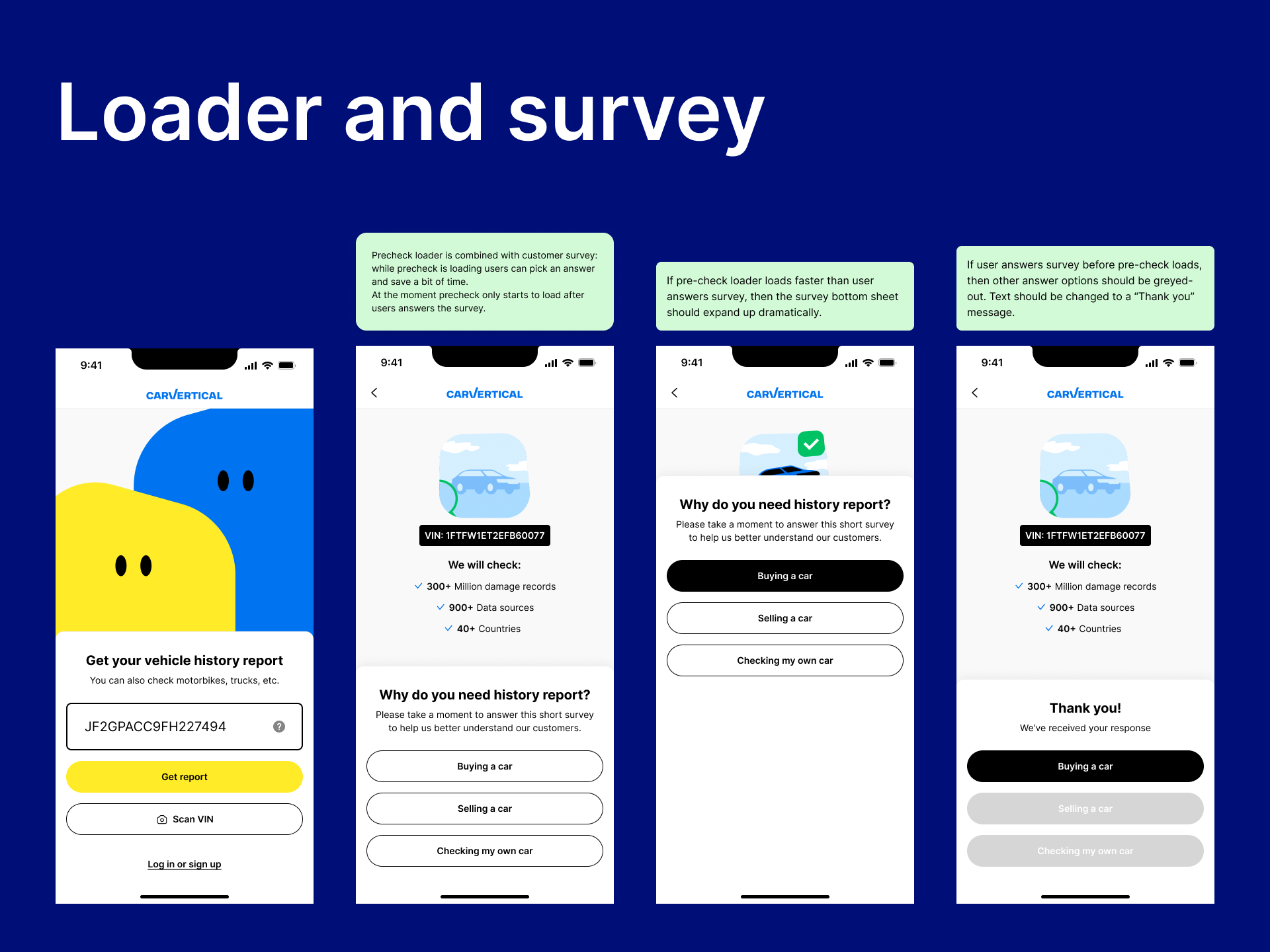
Beyond the reskin, I used it as an opportunity to reduce friction in key flows. I merged the pre-purchase survey with the loading screen — previously two separate steps — into a single screen, making the experience faster and more predictable. Introduced AZTEC code scanning for the Polish market, designed a market selector that prompted users to correct their market settings when their device location didn't match — improving the accuracy of report data for those users. And designed a notification hub.
The combined survey and loader pattern was later adopted on the web funnel.


Precheck redesign
Through moderated usability interviews, I identified a recurring mental model mismatch: users who had entered one VIN didn't understand why they were being offered 1, 2, or 3 reports. Many assumed the tiers unlocked different categories of information — buy 2 to get accident history and mileage, buy 3 to get everything. In reality, all reports contained the same data; the bundles were credits to check additional vehicles later.
I redesigned the pricing cards to make this explicit — each card now clearly states what the user gets with each plan, plus how many credits they'll have for future vehicles. Tooltips were added to show where those credits live in their account.
After implementation, support requests around pricing confusion dropped and conversion improved.

Purchase flow
Beyond individual page redesigns, I worked on several friction points in the overall purchase flow.
A significant issue affected returning users: when someone entered their email to start a purchase, an account was silently created for them — with no password and no mention of the account. If they left without buying and came back later, they'd be asked for a password they'd never set. The only way out was the "forgot password" flow, which never returned them to checkout.
I proposed three solutions. Guest checkout was blocked — reports need to tie to an account. Delaying email capture was blocked — marketing needed emails earlier in the funnel. The third option, a one-time password sent to the user's email, was technically feasible. I worked with the head of engineering to get it implemented.
I had also proposed delaying account creation until after purchase — a change the product has since made, moving in the direction I originally advocated for.
A separate issue involved the "I don't have VIN" button on the landing page. User testing showed most people expected it to help them find their VIN — not redirect them to a credits-only pricing page. I proposed removing the button and allowing users to proceed without a VIN, naturally routing them to credits. The fix was first implemented on the web — validating that the insight held beyond the context I originally raised it in.
Checkout redesign
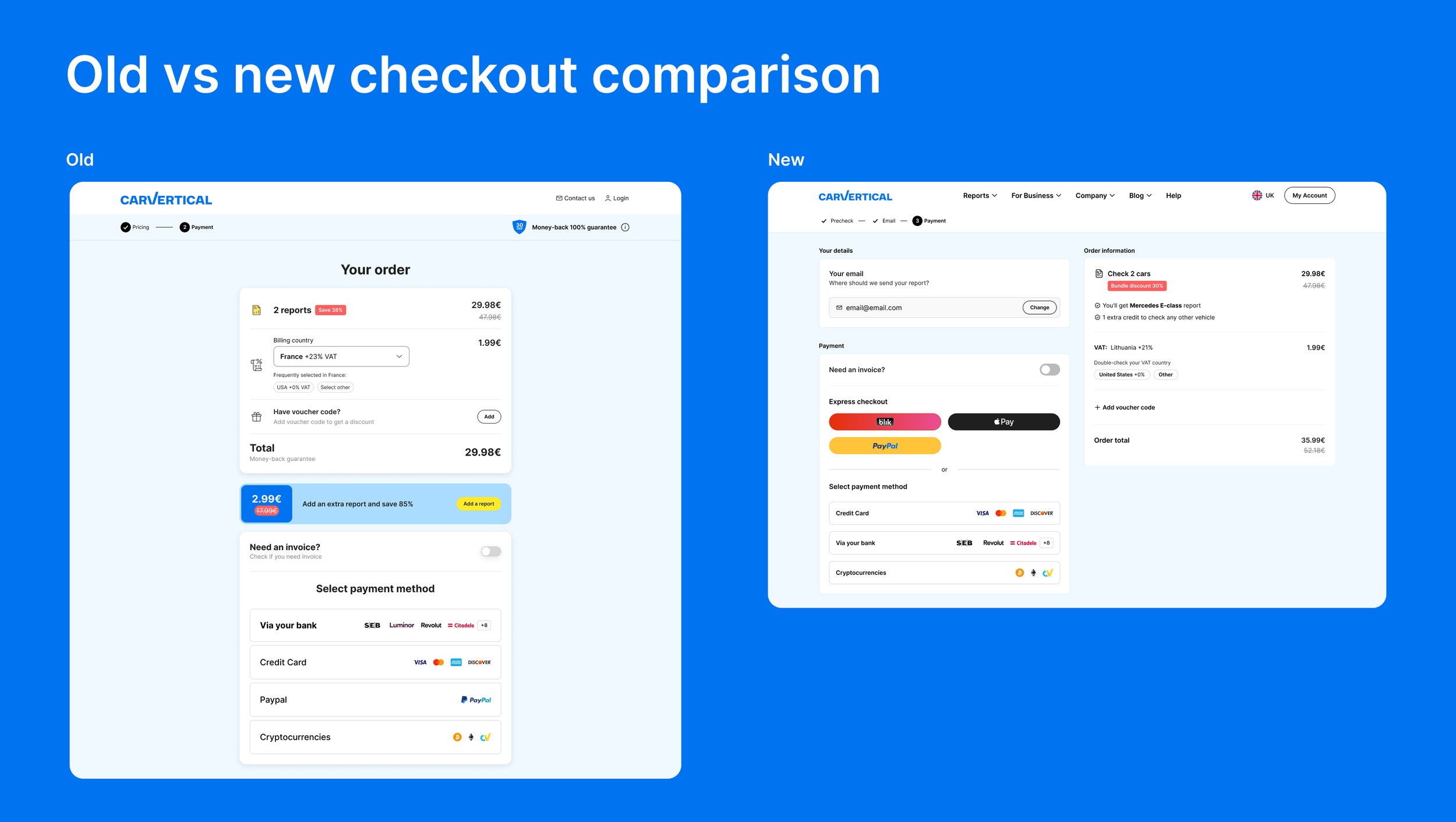
The desktop checkout was a direct copy of the mobile layout — a single vertical strip that left most of the screen unused. I redesigned it as a two-column layout for desktop, putting payment details and order summary side by side so users could see what they were buying without scrolling.
A/B tested against the original — improved conversion and revenue.
Blog redesign
The blog no longer matched carVertical’s rebranded identity, so I redesigned it using the updated design system and the new brand guidelines. The new layout introduced a scrollable table of contents and a reading progress indicator to improve navigation and reader engagement.
